Overview
ggplot2 is a powerful R package for creating elegant data visualizations. This page includes visual examples, interpretation, and helpful links to support your learning.
External Resources
- 🌐 R for Data Science
Using RStudio for Data Analysis
Example Output
Faceted Scatter Plot
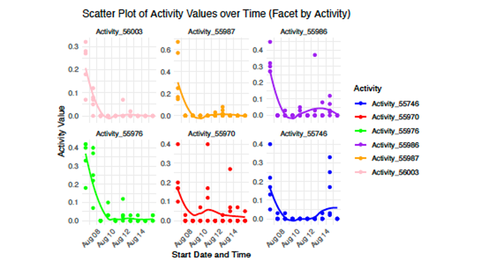
Description and Interpretation:
The facet has been reordered along with colors changed, which visually appears to make it easier to distinguish increased activity for mouse 55976 versus others.
Density Ridge Plot
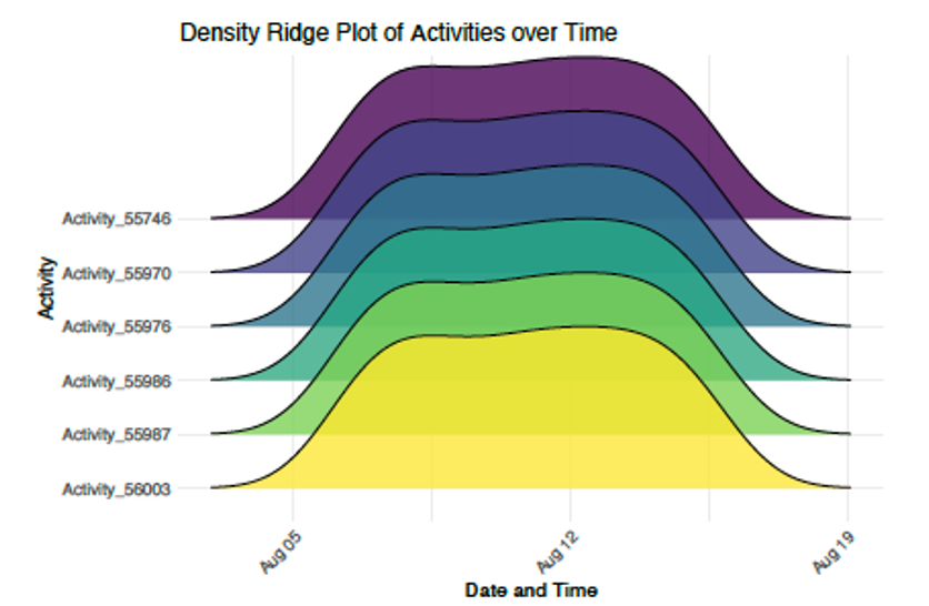
Description and Interpretation:
This density plot illustrates how each mouse’s activity was fairly normally distributed over the time period of August 5 to August 19. The wider ridges highlight a broader spread or more variability in the activity.